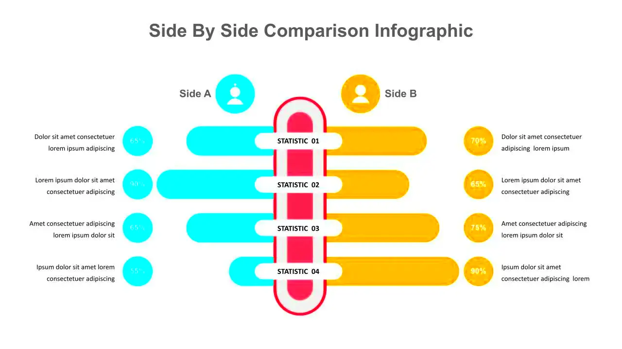
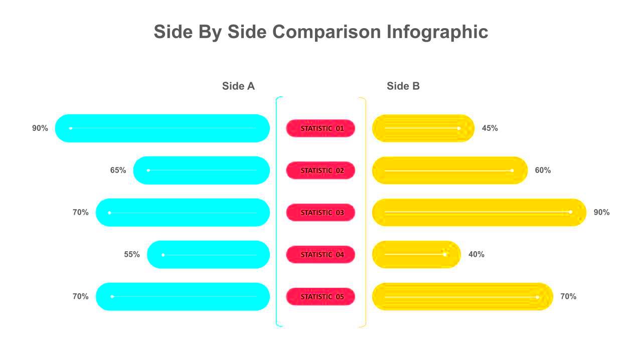
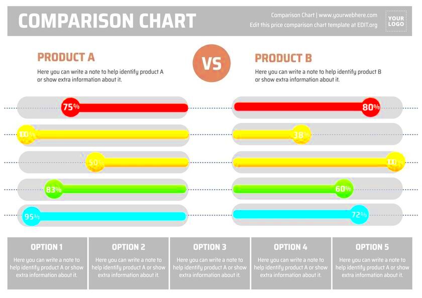
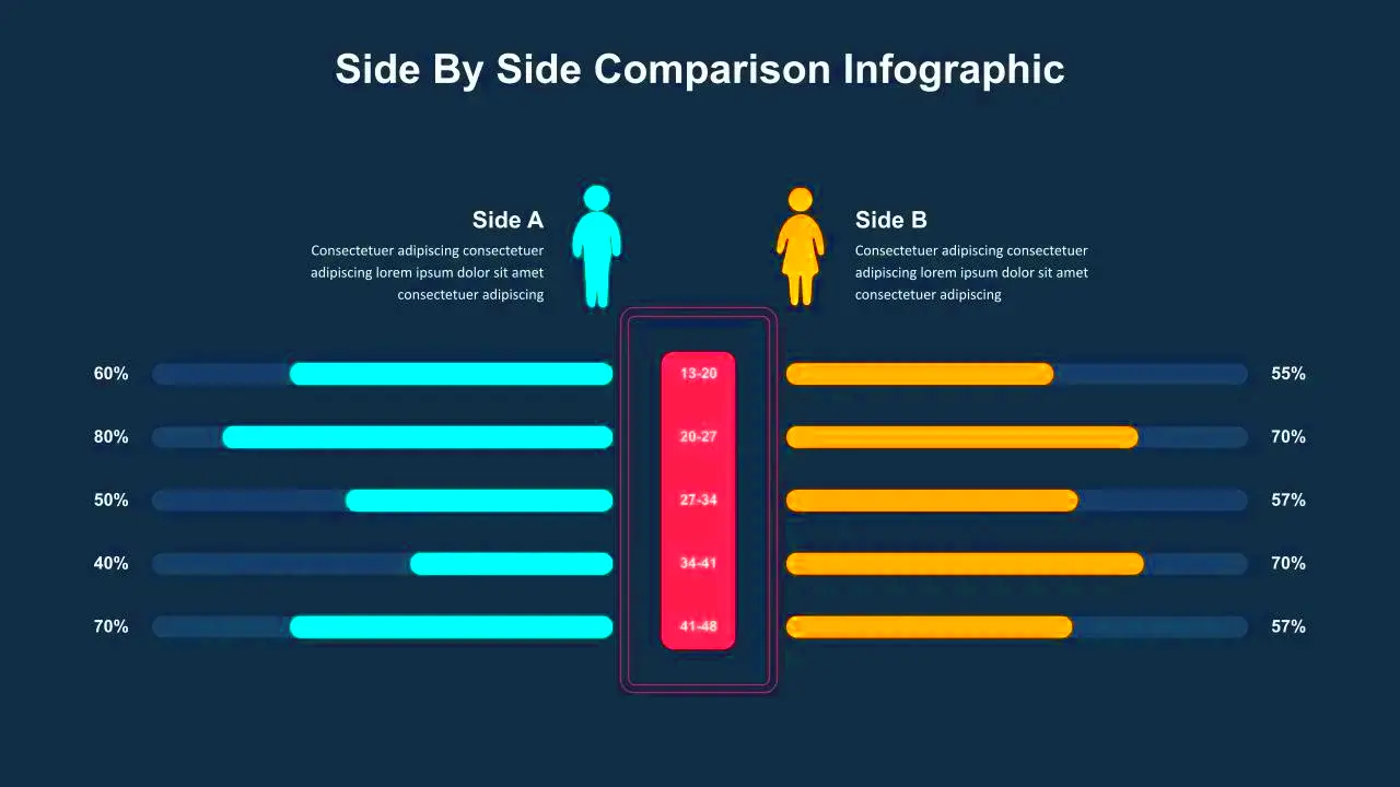
Side-by-side images are a great way to showcase comparisons, changes, or different perspectives. Whether you're looking to illustrate before-and-after scenarios, product differences, or any two related visuals, displaying images next to each other can effectively communicate your message. This method allows viewers to grasp contrasts quickly and helps them make informed decisions.
Benefits of Using Side-by-Side Images

There are several advantages to using side-by-side images in your content:
- Enhanced Clarity: Presenting images side by side makes it easier for viewers to notice differences and similarities at a glance.
- Improved Engagement: Compelling visuals can capture attention and keep users engaged longer.
- Effective Storytelling: Side-by-side images can convey a narrative or process in a straightforward manner.
- Visual Comparison: They allow for direct comparison between two or more elements, making it clear which one might be preferable.
- Versatile Usage: This format works well across various industries, from marketing to education.
Also Read This: How to Download a Gallery from a Behance Profile
How to Create Side-by-Side Images

Creating side-by-side images is a straightforward process. Here’s how you can do it:
- Choose Your Images: Select images that are relevant and support your message.
- Use Editing Software: Programs like Adobe Photoshop or online tools like Canva can help you arrange your images. You can also use HTML and CSS for web display.
- Adjust Image Size: Ensure both images are of similar size for a uniform look. You can use the same width for both images to maintain consistency.
- Add Borders or Shadows: This can help differentiate the images and make them stand out.
- Include Captions: Providing context for each image can enhance understanding. Captions can explain what each image represents.
By following these steps, you can easily create eye-catching side-by-side images that effectively communicate your ideas.
Also Read This: How to Combine Multiple Videos for Your YouTube Channel
Tools for Displaying Side-by-Side Images

When it comes to displaying side-by-side images, having the right tools can make a big difference. There are various options available, from software to online platforms, that can help you create stunning visuals with ease. Here are some popular tools you might consider:
- Adobe Photoshop: A powerful editing software that provides extensive features for arranging images. It allows for precise control over image sizes and placements.
- Canva: An intuitive online design tool perfect for beginners. Canva offers templates specifically for side-by-side comparisons, making it easy to create visually appealing layouts.
- GIMP: A free alternative to Photoshop, GIMP has many advanced features for image manipulation and comparison layouts.
- HTML/CSS: If you’re familiar with web development, using HTML and CSS to position images side by side is effective. You can easily control the size, alignment, and spacing.
- PowerPoint: For presentations, PowerPoint allows you to easily insert images and arrange them side by side with minimal effort.
These tools not only help you create side-by-side images but also ensure they look professional and engaging. Choose the one that best fits your needs and skill level.
Also Read This: How to Import Data from an Image into Google Sheets
Best Practices for Side-by-Side Image Layouts
Creating effective side-by-side images involves more than just placing two images next to each other. Here are some best practices to keep in mind:
- Maintain Consistency: Ensure both images are similar in size, orientation, and lighting to avoid distracting viewers.
- Use Clear Labels: Label each image clearly, so viewers understand what they are comparing. Simple captions work well.
- Choose a Suitable Background: A neutral background helps the images stand out. Avoid overly busy backgrounds that can take attention away.
- Consider Image Quality: Use high-resolution images to ensure clarity. Low-quality images can make your comparison less effective.
- Test Responsiveness: If displayed on a website, ensure the layout is responsive. Images should resize well on different devices.
Following these best practices can help your side-by-side images deliver the intended message clearly and effectively.
Also Read This: The Science of Viral TikTok Videos: What Makes Them So Addictive
Common Mistakes to Avoid
While creating side-by-side images can be straightforward, some common mistakes can undermine their effectiveness. Here are a few pitfalls to watch out for:
- Uneven Sizes: Placing images of different sizes can confuse viewers. Always aim for uniformity.
- Overloading with Text: Too much text can clutter your layout. Keep captions concise and to the point.
- Ignoring Contrast: If the images are too similar in color or tone, it can be hard to see the differences. Choose images that highlight the contrast effectively.
- Neglecting Accessibility: Ensure that images are accessible to all users. Use alt text for web images so that those using screen readers can understand the content.
- Skipping Testing: Before finalizing your images, test them on different devices. What looks good on one screen may not work on another.
Avoiding these common mistakes can significantly enhance the effectiveness of your side-by-side image presentations, making them clearer and more impactful.
Also Read This: How Much is Adobe Stock a Month in 2023?
Examples of Effective Side-by-Side Images
Seeing is believing, especially when it comes to side-by-side images. Here are a few examples of how this format can be effectively utilized:
- Before and After Comparisons: A classic example is in the beauty industry, where before-and-after images show the results of skincare or makeup products. This helps potential customers visualize the effectiveness of the product.
- Product Features: For tech products, side-by-side images can highlight differences in features, such as size or color variations. This approach helps consumers make informed choices based on their preferences.
- Historical Comparisons: In educational content, you can display historical images next to modern ones to showcase changes over time, like architecture or fashion evolution.
- Food Comparisons: Restaurants often use side-by-side images to show the difference between portion sizes, or how a dish looks before and after cooking, enticing customers to order.
- Infographics: Infographics that compare statistics or data visually often benefit from side-by-side imagery, making complex information digestible.
These examples illustrate how side-by-side images can effectively convey information, capture attention, and enhance understanding, making them a valuable tool in various fields.
Also Read This: How to Upload Voice Memo to YouTube with Ease
FAQ
Here are some frequently asked questions about side-by-side images that can help clarify their use and benefits:
- What types of images work best for side-by-side comparisons? Images that are related and have clear differences or similarities work best. Examples include product variations, before-and-after shots, and statistical comparisons.
- How can I ensure my side-by-side images are visually appealing? Focus on consistency in size and quality, use contrasting colors, and incorporate clear labeling to guide viewers.
- Are there specific software tools recommended for creating side-by-side images? Yes, tools like Adobe Photoshop, Canva, and GIMP are excellent for creating these types of layouts.
- Can I use side-by-side images in social media posts? Absolutely! Side-by-side images can be very effective on social media for engagement and visual storytelling.
- How do I make my side-by-side images accessible? Use descriptive alt text for web images to ensure that they are accessible to all users, including those using screen readers.
Conclusion
Side-by-side images are a powerful way to communicate information effectively and visually. They enhance clarity, engagement, and understanding by allowing viewers to compare and contrast images easily. Whether for marketing, education, or storytelling, this format can bring your content to life. Remember to choose your images wisely, follow best practices, and avoid common mistakes to make the most of this versatile tool. By doing so, you'll create visually appealing and informative comparisons that capture your audience's attention and help convey your message more effectively.

 admin
admin


