Visuals play a vital role in making your Squarespace website more engaging and appealing. They help convey your message, showcase your brand, and enhance the overall user experience. By incorporating the right visuals, you can grab visitors' attention and keep them interested in your content.
Importance of Aesthetics for Your Website
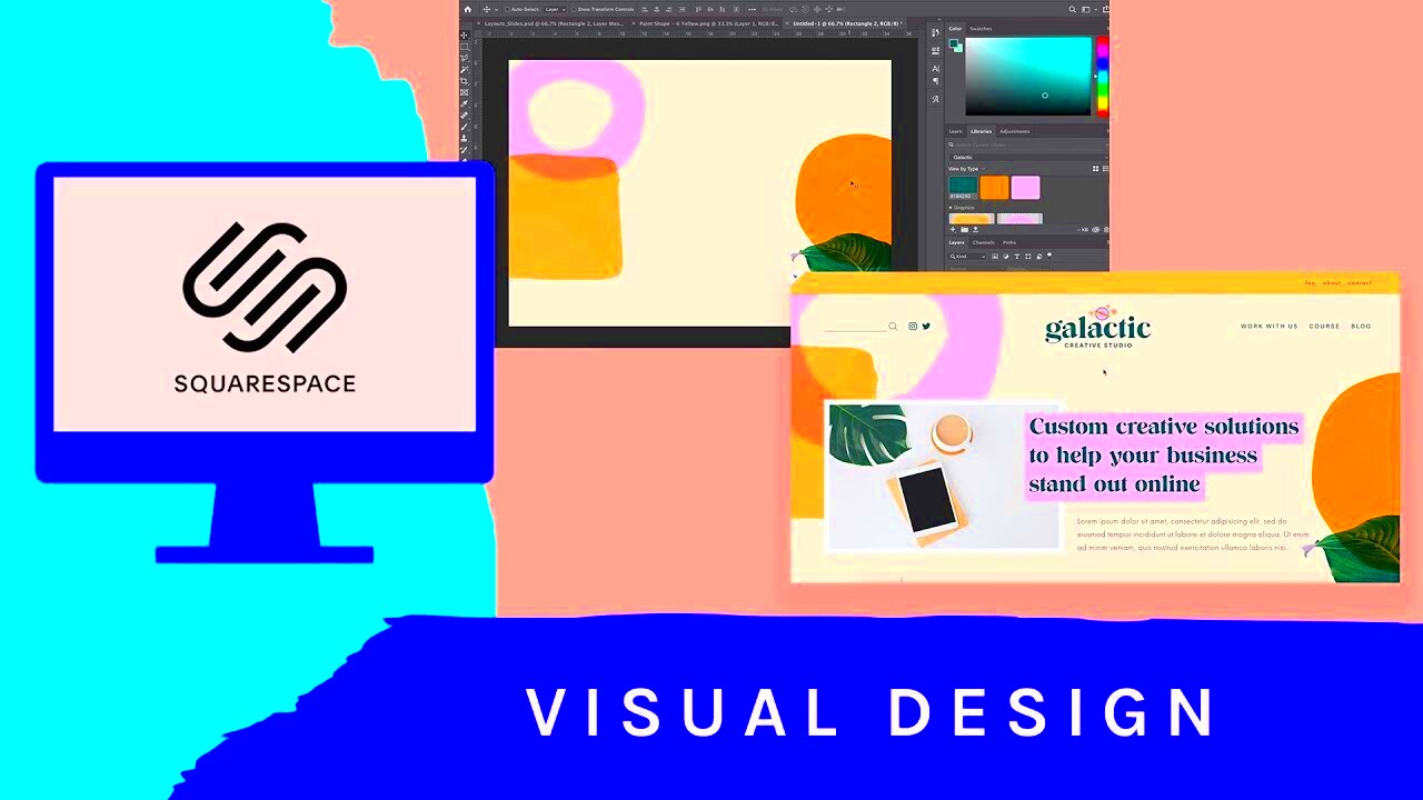
Aesthetics matter because they can significantly impact how users perceive your brand. When your website looks good, visitors are more likely to trust your content and engage with it. Here are a few reasons why aesthetics are crucial:
- First Impressions Count: A well-designed site creates a positive first impression, encouraging users to explore more.
- Enhanced User Experience: Attractive visuals can make navigation easier and more enjoyable.
- Brand Recognition: Consistent visuals help reinforce your brand identity, making it memorable.
- Increased Engagement: Users are more likely to spend time on a visually appealing site, which can lead to higher conversion rates.
In a digital world filled with content, standing out is essential. Aesthetic choices directly influence how users interact with your site, so make them count.
Types of Visuals to Use in Squarespace
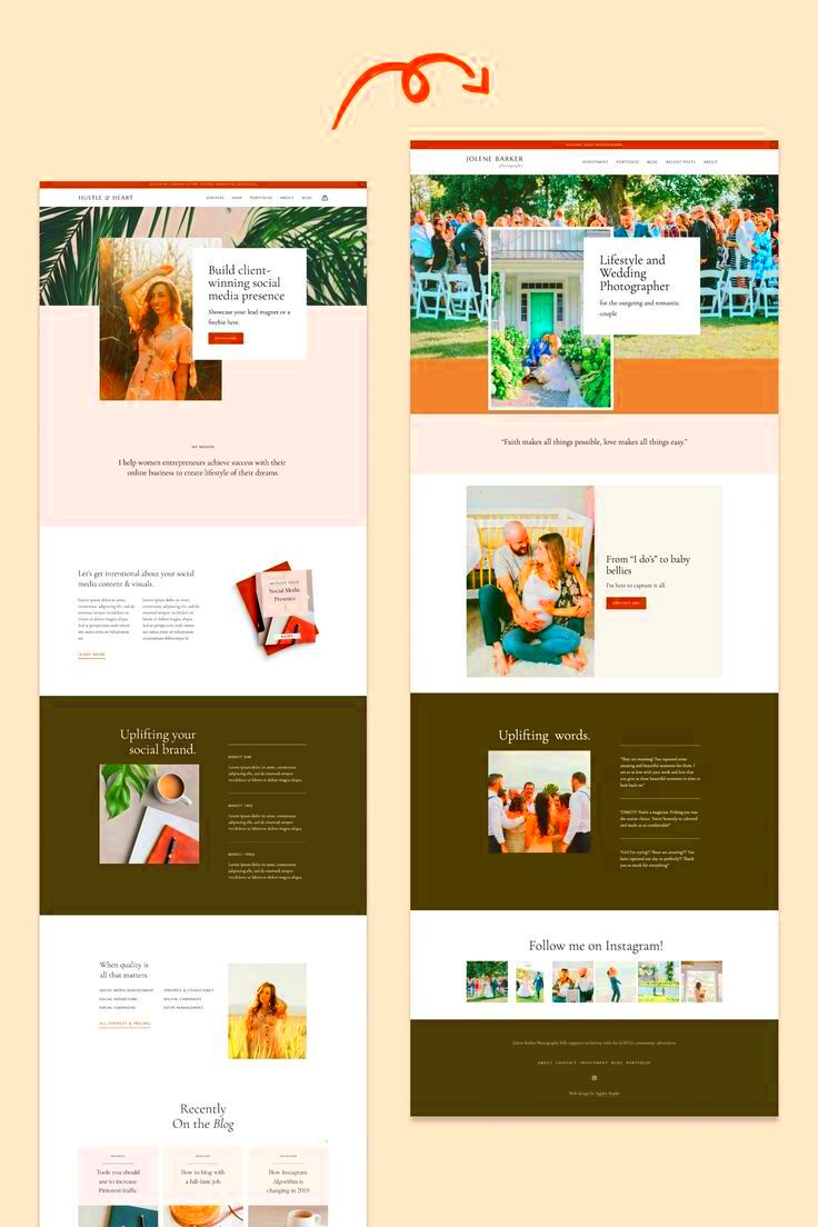
When it comes to adding visuals to your Squarespace website, there are several types you can choose from. Each type serves a different purpose and can enhance your content in unique ways. Here are some popular options:
- Images: High-quality images are essential for showcasing products or services. They create an emotional connection with your audience.
- Videos: Video content can effectively tell your brand's story and engage visitors. Consider using short clips or background videos.
- Galleries: Use galleries to display multiple images in a cohesive way, perfect for portfolios or product showcases.
- Slideshows: Slideshows allow you to highlight key content or products in an interactive format, keeping visitors engaged.
- Icons: Simple icons can enhance navigation and add visual interest without overwhelming your layout.
- Infographics: Infographics convey complex information visually, making it easier for users to understand your message.
By mixing these visual types effectively, you can create a dynamic and engaging Squarespace site that captures and holds your audience's attention.
How to Add Images and Videos

Adding images and videos to your Squarespace site is a straightforward process that can significantly enhance your content. Visuals help tell your story, showcase your products, and make your website more appealing. Here’s how to do it effectively:
To add images:
- Log in to your Squarespace account and navigate to the page where you want to add visuals.
- Click on the "+" icon to add a new block and select the Image block from the menu.
- Upload your image or select one from the library. Ensure the image is high quality and relevant to your content.
- Customize the image settings, such as alignment and caption, to fit your design.
For videos, follow these steps:
- Again, click on the "+" icon where you want to insert the video.
- Select the Video block. You can add videos from YouTube, Vimeo, or upload directly from your computer.
- Paste the video URL or upload your file, and adjust the settings as needed.
Remember to optimize your images and videos for faster loading times to improve user experience and SEO!
Using Galleries and Slideshows
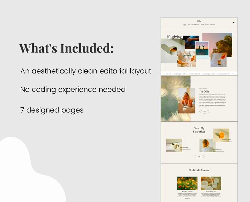
Galleries and slideshows are fantastic ways to display multiple images without cluttering your page. They can help visitors engage with your content and are perfect for showcasing portfolios or products. Here’s how to set them up:
To create a gallery:
- Go to the page where you want the gallery.
- Click the "+" icon and choose the Gallery block.
- Select your images and upload them. You can choose different gallery styles, such as grid or slideshow.
- Customize the settings to control how your gallery displays images.
For slideshows:
- Navigate to the desired page and click the "+" icon.
- Choose the Slideshow block.
- Add images to your slideshow. You can also add captions for each slide.
- Adjust the slideshow settings for timing and transition effects.
Galleries and slideshows not only improve aesthetics but also encourage users to spend more time on your site, leading to better engagement.
Incorporating Icons and Graphics
Icons and graphics are essential elements that can enhance your Squarespace site’s visual appeal and functionality. They help convey messages quickly and effectively while adding a modern touch to your design. Here’s how to incorporate them:
To add icons:
- Identify where icons would enhance your content, like in lists or as navigational aids.
- Use the Image block to upload individual icons, or you can use an icon font service for more options.
- Ensure your icons are consistent in style and color to maintain a cohesive look.
For graphics:
- Create or source graphics that align with your brand. This could include illustrations, charts, or infographics.
- Use the Image block to add these graphics to your page.
- Consider adding hover effects to make graphics interactive, enhancing user engagement.
Utilizing icons and graphics not only makes your site more visually appealing but also helps guide users through your content seamlessly. Remember to keep your design clean and not overcrowded to maintain clarity.
Best Practices for Visual Content
Creating effective visual content is more than just throwing images onto your Squarespace site. It’s about using visuals strategically to enhance your message and engage your audience. Here are some best practices to keep in mind:
- Choose High-Quality Images: Always use high-resolution images to maintain a professional look. Blurry or pixelated visuals can turn visitors away.
- Keep It Relevant: Ensure that your visuals align with your content. They should support your message rather than distract from it.
- Optimize for Fast Loading: Large files can slow down your site. Compress images and videos to improve loading times without sacrificing quality.
- Maintain Consistency: Use a consistent style for images, colors, and fonts throughout your site. This creates a cohesive brand identity.
- Utilize Alt Text: Always include alt text for images. This not only improves accessibility for visually impaired users but also boosts your SEO.
- Test on Mobile: Make sure your visuals look good on mobile devices. A significant portion of web traffic comes from smartphones.
By following these best practices, you can create a visually appealing website that captivates and retains your audience.
FAQ
Let’s address some common questions about using visuals in Squarespace:
- Can I use stock images? Yes, stock images are great for enhancing your content. Just ensure they align with your brand and message.
- How do I improve loading times for images? Compress your images before uploading. Use tools like TinyPNG or similar to reduce file size without losing quality.
- What’s the best format for images? JPEG is ideal for photographs, while PNG is better for graphics and images that require transparency.
- How can I make my visuals more engaging? Use a mix of images, videos, and graphics. Incorporate animations and interactive elements where appropriate.
Conclusion
Incorporating visuals into your Squarespace site is crucial for creating an engaging and aesthetically pleasing experience for your visitors. By following the tips and best practices outlined above, you can enhance your content, improve user experience, and ultimately drive better engagement and conversions. Remember, your visuals should tell a story and complement your message. As you implement these strategies, keep your audience in mind, and don’t hesitate to experiment with different visual types to find what works best for your brand. A well-designed site with compelling visuals can make a significant difference in how users perceive your content.
 admin
admin

