Overlapping
images can add depth and creativity to your documents. It’s a simple technique that can transform a plain page into something visually striking. Whether you're creating a brochure, a presentation, or a report, knowing how to overlap
images effectively can enhance your design and communicate your message better. In this guide, we’ll explore how to choose.
Choosing the Right Images for Overlapping
Picking the right
images is crucial for creating an engaging layout. Here are some tips to consider:
- High Quality: Always opt for high-resolution images to ensure clarity, especially when they overlap.
- Complementary Colors: Choose images with colors that work well together. This harmony can make your design look cohesive.
- Similar Themes: Images that share a theme or subject can help tell a story when overlapped.
- Transparent Backgrounds: Images with transparent backgrounds work best for overlaps as they blend seamlessly.
Experimenting with different
images can lead to unique combinations. Don’t hesitate to play around until you find what works best for your project.
Using Text Wrapping for Better Layout
Text wrapping allows you to control how text interacts with
images in your document. This is essential when overlapping
images because it helps maintain a clean and organized layout. Here’s how to use text wrapping effectively:
- Wrap Text Around: This option lets text flow around the image, making your layout dynamic. Select the image, then choose the wrapping style from the formatting options.
- In Line with Text: This option places the image in line with your text, making it look like part of the paragraph. Use this for a simpler design.
- Behind Text: This style places the image behind the text, allowing for creative overlaps. Ensure the text is still readable.
- Through: This option allows text to flow in and out of the image, creating a more integrated look.
Choose the wrapping style that best fits your design goals. Adjusting the text wrap settings can dramatically improve the visual flow of your document.
Adjusting Image Position and Size
Once you’ve selected your
images, the next step is adjusting their position and size. Proper placement is vital to achieve the desired look. Here’s how to do it effectively:
- Drag and Drop: Simply click on the image and drag it to your preferred position. This hands-on approach gives you immediate visual feedback.
- Use the Format Menu: Right-click on the image and select “Format Picture.” Here, you can input exact measurements for width and height to ensure consistency.
- Aspect Ratio: Maintain the aspect ratio to prevent distortion. Most programs allow you to lock this feature when resizing.
- Align Images: Use alignment tools in your software to center or align images neatly on the page. This helps create a professional look.
- Layering with Shortcut Keys: Use shortcut keys (like Ctrl+Arrow keys) to nudge images into place without dragging.
Adjusting the size and position of images can make a significant difference in how your layout feels. Experimenting with different placements can lead to surprising results, so don’t hesitate to play around until you find the perfect look!
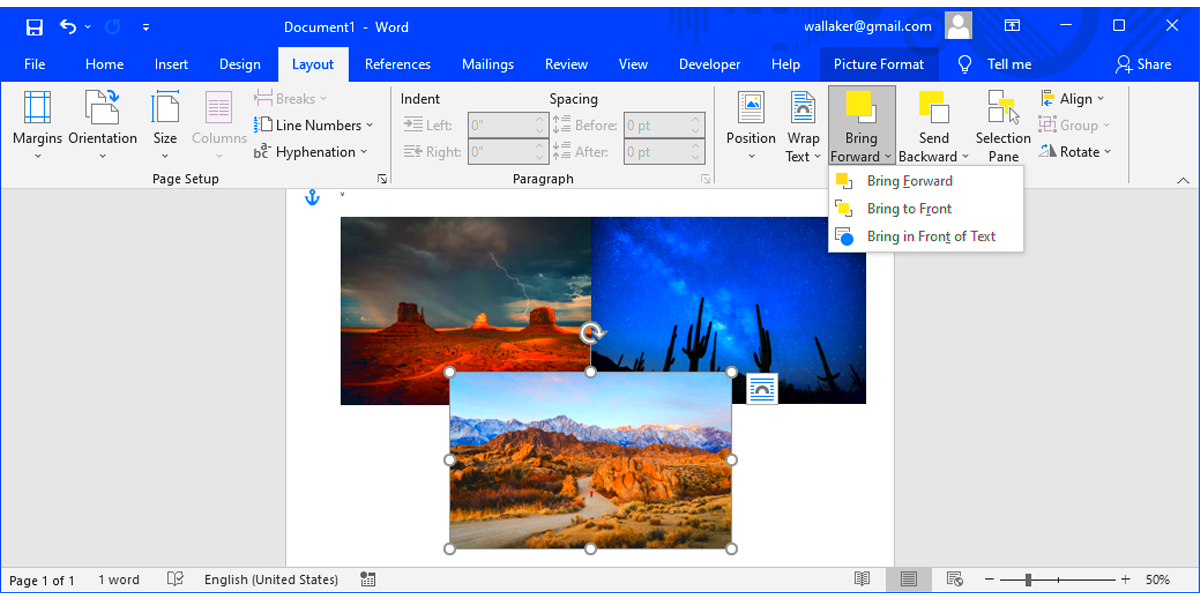
Creating a Layered Effect with Images
Layering images can add depth and interest to your design. When done correctly, it can draw the viewer's eye and enhance the overall aesthetic. Here’s how to create a layered effect:
- Stacking Images: Place one image on top of another. Adjust their sizes so that the top image partially covers the bottom one for a striking look.
- Using Shadows: Add shadows to your images to create the illusion of depth. This helps separate layers visually.
- Changing Order: Use the “Bring Forward” or “Send Backward” options to control which image appears on top. This lets you play with the visual hierarchy.
- Group Images: Grouping images together can make it easier to move and adjust them as a single unit.
Layering images not only makes your design more dynamic but also allows for creative storytelling. Remember to consider how each layer interacts with the others, and don’t be afraid to experiment!
Utilizing Transparency for a Seamless Look
Using transparency can make your images blend beautifully into the background or with each other. This technique adds a polished, professional feel to your design. Here’s how to incorporate transparency:
- Adjust Opacity: Most image editing tools allow you to change the opacity. Lowering the opacity can make an image more transparent, creating a softer look.
- Blend Modes: Explore blend modes to see how one image interacts with another. Some modes can create stunning effects by merging colors and textures.
- Transparent PNGs: Use PNG images with transparent backgrounds for a seamless integration into your design. This is particularly effective when overlapping images.
- Layer Transparency: Apply different levels of transparency to each layer of images. This can create depth while maintaining clarity.
Incorporating transparency is a game-changer for achieving a seamless look. It allows your images to interact in a way that feels natural and cohesive. Don't be afraid to experiment with different levels of transparency until you find the perfect balance!
Common Mistakes to Avoid When Overlapping
Overlapping images can enhance your designs, but there are pitfalls to watch out for. Here are some common mistakes that can hinder your efforts and how to avoid them:
- Poor Image Quality: Using low-resolution images can result in pixelation when they overlap. Always choose high-quality images for the best results.
- Ignoring Alignment: Misaligned images can create a chaotic look. Use alignment tools to keep everything neat and tidy.
- Overcrowding the Layout: Too many overlapping images can make your design feel cluttered. Aim for a balanced layout with enough white space.
- Neglecting Color Harmony: Colors that clash can distract viewers. Make sure your images have a cohesive color palette to enhance their visual appeal.
- Forgetting Text Readability: Overlapping images behind text can obscure readability. Always ensure that text remains clear and legible against your images.
By avoiding these common mistakes, you can create professional and visually appealing designs that effectively communicate your message.
Practical Examples of Overlapping Images
Seeing how overlapping images can be applied in real-life scenarios can spark your creativity. Here are some practical examples:
- Brochures: Use overlapping images to showcase products and services. This adds a dynamic touch and captures attention.
- Social Media Posts: Layer images to create eye-catching graphics. For instance, a transparent logo over a striking background image can be very effective.
- Presentations: When creating slides, overlapping images can help emphasize key points and keep the audience engaged.
- Web Design: Use overlapping elements on websites to create depth and interest in your layouts.
These examples demonstrate how versatile overlapping images can be in various contexts. Don’t hesitate to try these ideas in your own projects!
FAQ
Here are some frequently asked questions about overlapping images:
- What software can I use for overlapping images? You can use programs like Microsoft Word, Adobe Photoshop, Canva, or online design tools that support layering.
- Can I overlap images with text? Yes! Just make sure the text remains readable by adjusting image opacity or positioning.
- How do I maintain image quality when overlapping? Always use high-resolution images and ensure you adjust their sizes proportionately.
- Are there any specific file types recommended for transparency? PNG files are best for transparent backgrounds, as they allow for clean overlaps without a visible border.
- Can I layer images on mobile apps? Yes, many mobile apps like Canva and PicsArt allow you to layer images easily.
Feel free to explore and ask more questions as you start working with overlapping images. It’s all about experimentation and finding what looks best for your project!
Conclusion
Overlapping images can transform your designs from ordinary to extraordinary. By understanding the techniques of choosing the right images, adjusting their size and position, and utilizing transparency, you can create visually appealing layouts that engage your audience. Remember to avoid common mistakes like misalignment and overcrowding, and don't hesitate to experiment with practical examples in various contexts. With practice, you'll become more confident in using overlapping images effectively in your projects. So go ahead and start layering those images to bring your ideas to life!
 admin
admin