Making an image cover the whole page means that the image stretches to fill the entire background of a webpage. The
Whether you want to emphasize a product, create an emotional connection, or simply add visual appeal, full-page images can significantly enhance the overall look of your site. When used correctly, these images can help captivate your audience right from the moment they land on your page.
Why Full-Page Images Are Popular in Web Design
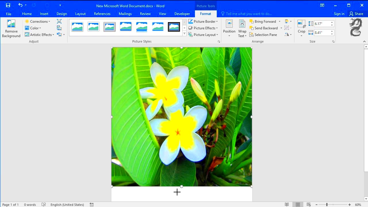
Full-page images have become increasingly popular in web design for a variety of reasons. They provide a powerful visual impact and can instantly grab the attention of visitors. Here are some reasons why they are a favorite among web designers:
- Immersive Experience: Full-page images help users focus on the message without distractions from other elements on the page.
- Branding Opportunities: A well-chosen image can reflect the brand's tone, values, and identity in a visually compelling way.
- Better Engagement: High-quality images create an emotional connection with viewers, making them more likely to explore further.
- Responsive Design: When done right, full-page images can look great on any screen size, from desktops to mobile devices.
This design choice is effective for storytelling, product showcasing, or simply making your website stand out among the competition.
Also Read This: Stretching Images in Canva Without Cropping
Steps to Make an Image Cover the Whole Page Using Canva
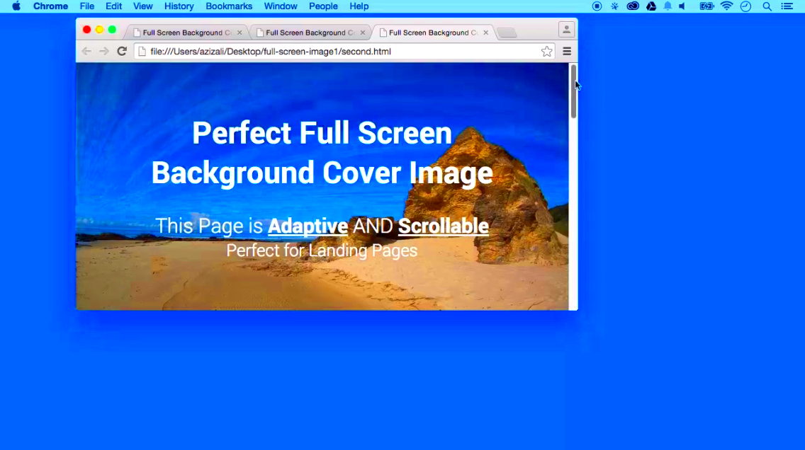
If you're looking to create a full-page image for your website using Canva, follow these simple steps:
- Open Canva: Log in to your Canva account or sign up for free if you're a new user.
- Choose a Custom Size: Go to the "Create a design" option and select "Custom size." Enter the dimensions suitable for your website, such as 1920x1080 pixels for a standard full-page image.
- Upload Your Image: Click on the "Uploads" option and upload the image you want to use. Alternatively, you can choose from Canva's wide range of stock images.
- Resize the Image: Drag the corners of the image to stretch it across the entire canvas until it covers the whole page.
- Adjust the Position: Use the alignment tools to center the image or adjust it as needed. Ensure it’s not cut off in awkward places, especially if there's important content in the image.
- Download the Image: Once you’re happy with the design, click on "Download" and select the desired file format (JPEG or PNG) for your website.
These steps make it easy to create visually appealing full-page images using Canva, even if you're not a professional designer.
Also Read This: how to cut out part of an image in photoshop
Tips for Choosing the Right Image for Full-Page Display
Selecting the right image for a full-page display is crucial. The image you choose will not only set the visual tone of your webpage but also affect how your visitors engage with your content. Here are some tips to ensure you're picking the best possible
- High Resolution: Since the image will be stretched to cover the entire page, it’s important to use a high-resolution image to avoid pixelation. Aim for at least 1920x1080 pixels for desktop screens.
- Minimalist and Clean: Simple images with fewer details often work best as full-page backgrounds. Too much detail can distract from the main content of your page.
- Consistency with Brand Colors: Choose an image that complements your brand’s color palette. This will create a cohesive look across your site.
- Relevant to Your Message: The image should align with the purpose of the page. For example, if your page is promoting a beach resort, a stunning beach photo will resonate well with your audience.
- Focus on Emotion: Images that evoke emotions tend to connect better with visitors. Whether it's a serene landscape or a vibrant cityscape, make sure the image aligns with the feeling you want to convey.
By keeping these tips in mind, you’ll be able to choose an image that enhances your website’s message and aesthetic without overwhelming the viewer.
Also Read This: How to Put an Edible Image on a Cake for Personalized Desserts
Best Practices for Creating Full-Page Images
Creating a full-page image that looks good on all screen sizes and devices requires careful attention to detail. Here are some best practices to follow:
- Responsive Design: Ensure your image adjusts well across different devices. Use CSS properties like
background-size: cover;to automatically resize the image without losing its quality. - Optimize for Web: Large images can slow down your page. Compress your images using tools like TinyPNG or Canva’s built-in compression feature to ensure fast loading times.
- Test Different Devices: Preview your design on both mobile and desktop to make sure the image scales properly and no important parts are cropped out.
- Use Overlay Text Carefully: If you plan to add text on top of your full-page image, consider using a slight overlay to improve readability. Darkening the image or using a semi-transparent background behind the text works well.
- Subtle Visuals: Avoid overly complex or busy images. Subtle gradients, soft patterns, or nature-inspired backgrounds often make for great full-page visuals.
Following these practices will help you create a full-page image that’s both visually appealing and functional across all devices.
Also Read This: How to Fade an Image in Canva for Subtle Backgrounds
Common Mistakes to Avoid When Creating Full-Page Images
While full-page images can elevate your website’s design, there are several common mistakes that can detract from the overall user experience. Here are some pitfalls to avoid:
- Poor Image Quality: Low-resolution images can appear blurry or pixelated when stretched to cover the whole page. Always use high-quality, high-resolution images.
- Too Much Text: Avoid cluttering your full-page image with too much text. This can make the page look busy and difficult to read.
- Ignoring Load Speed: Large images can drastically slow down page load times, negatively impacting user experience. Always optimize your images for faster loading.
- Clashing Colors: Using an image that clashes with the text or other elements on your page can make the design feel disjointed. Ensure your image complements the overall design.
- Not Testing Responsiveness: Failing to test how the image looks on different devices (desktop, tablet, mobile) can result in awkward cropping or stretched visuals.
- No Focal Point: Images without a clear focal point can feel overwhelming. Make sure the important part of the image is properly centered or positioned to draw attention.
By avoiding these mistakes, you can ensure that your full-page image enhances your website’s appearance without compromising functionality or usability.
Also Read This: How to Widescreen Dailymotion Videos
FAQ About Full-Page Images
Here are some frequently asked questions about using full-page images in web design. These will help clear up common doubts and provide practical tips for getting the best results.
- Can I use any image as a full-page background?
- Will full-page images slow down my website?
- How can I ensure the image looks good on both desktop and mobile?
- What file format should I use for full-page images?
- Is it okay to add text over full-page images?
While you can technically use any image, it's important to choose high-resolution images that maintain their quality when stretched. Additionally, the image should complement your website's theme and purpose.
Large, uncompressed images can slow down your website, which affects user experience and SEO. To avoid this, make sure to optimize your images by compressing them while maintaining quality.
To ensure your image looks good on all devices, use responsive design techniques like CSS properties such as background-size: cover;. This ensures that the image automatically adjusts to fit any screen size without losing quality.
JPEG is often the best format for full-page images due to its balance between quality and file size. PNG is also a good option if the image has transparency, but it may result in larger file sizes.
Yes, but it’s important to make sure the text is readable. You can add a dark overlay to the image or use contrasting text colors to improve legibility.
Conclusion: Enhance Your Designs with Full-Page Images
Full-page images can significantly boost the visual appeal of your website when used correctly. By carefully selecting high-quality images, optimizing for performance, and ensuring responsive design, you can create stunning web pages that captivate your audience and enhance their browsing experience.

 admin
admin