When it comes to web design, the size of your images matters a lot. Not only does it affect how your website looks, but it also impacts its performance. Large images can slow down your site, leading to longer loading times and a poor user experience. This can cause visitors to leave your page before it even fully loads. On the other hand, images that are too small may look pixelated or unclear, which can detract from your content.
Here are a few reasons why managing image size is crucial:
- Loading Speed: Smaller images load faster, improving your website's overall speed.
- User Experience: Clear, properly sized images keep users engaged.
- SEO Benefits: Google favors faster websites, which can boost your search rankings.
- Responsive Design: Images should adapt to different screen sizes for optimal viewing.
Exploring CSS Properties for Image Resizing
CSS provides various properties that make it easy to resize images without losing quality. Understanding these properties can help you maintain the visual integrity of your site. Here are some key CSS properties for image resizing:
- Width: Sets the width of an image. You can use pixels (px), percentages (%), or other units.
- Height: Similar to width, this sets the image's height. Using percentages can maintain the aspect ratio.
- Max-width: Limits the maximum width of an image, ensuring it doesn’t exceed a certain size while still being responsive.
- Max-height: This sets a cap on the height of the image, allowing it to scale down without losing its ratio.
- Object-fit: This property defines how an image should be resized to fit its container. Options include
cover,contain, andfill.
Also Read This: Saving Images from Freeform on Mac
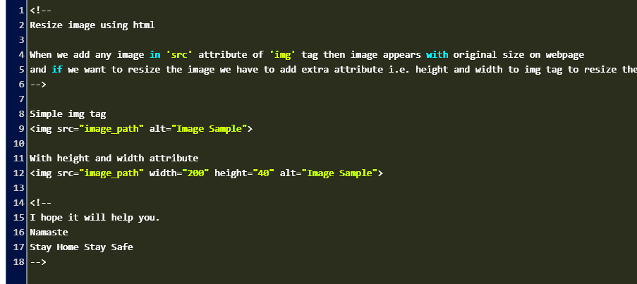
Using Width and Height Attributes in CSS
Setting the width and height attributes in CSS is one of the simplest ways to control the size of images. Here’s how you can use them effectively:
When you apply these properties, remember:
- Specify units: Use px for fixed sizes or % for responsive designs.
- Maintain aspect ratio: To keep your images proportional, set either width or height, letting the other adjust automatically.
- Example:
| CSS Property | Value |
|---|---|
| width | 50% |
| height | auto |
This setup ensures that your image will take up half the width of its container while keeping its height proportional. So, if the container's size changes, the image adjusts accordingly. Using these simple attributes can greatly enhance the visual appeal of your website.
Also Read This: How to Film YouTube Videos with Your iPhone
Applying Max-Width and Max-Height for Responsive Images
When designing a website, you want your images to look great on all devices. This is where using max-width and max-height in CSS comes into play. These properties help you maintain the quality of images while allowing them to resize based on the viewer's screen size. This is especially important in today’s mobile-first world.
Here’s why using these properties is beneficial:
- Flexibility: Images can expand to fill their container but won’t exceed a set limit, preventing distortion.
- Better User Experience: Properly sized images improve loading speed and visual appeal across devices.
- Responsive Design: Ensures that images adapt to different screen sizes without losing their aspect ratio.
Here’s a simple example of how you can apply these properties:
| CSS Property | Value |
|---|---|
| max-width | 100% |
| max-height | 400px |
This setup means that your image will fill up to 100% of its container's width but will never exceed 400 pixels in height. This way, your images will always look sharp and proportionate, enhancing the overall design of your website.
Also Read This: How to Find a Place from an Image
Utilizing CSS Background Properties for Image Control
Sometimes, using images as backgrounds can be more effective than placing them as inline elements. CSS provides several properties that allow you to control background images easily. Here’s how to do it:
Background images can be applied to almost any element, and these CSS properties help you manage them:
- background-image: Specifies the image to be used as the background.
- background-size: Controls the size of the background image. You can set it to
cover,contain, or specify dimensions. - background-repeat: Determines if the image should repeat or not. Use
no-repeatto prevent repetition. - background-position: Sets the starting position of the background image, allowing you to align it as desired.
Here’s an example:
| CSS Property | Value |
|---|---|
| background-image | url('image.jpg') |
| background-size | cover |
| background-repeat | no-repeat |
| background-position | center |
This setup ensures that your background image covers the entire element while staying centered and without repeating. Using CSS background properties can give you more control over your design.
Also Read This: What Are the Best Canva Template Downloader Tools for Watermark-Free Designs in 2025?
Common Mistakes When Resizing Images with CSS
Resizing images using CSS can be straightforward, but there are common pitfalls that can lead to frustrating results. Understanding these mistakes can help you avoid issues and improve your website's appearance. Let’s look at some frequent errors:
- Forgetting to Maintain Aspect Ratio: Resizing without keeping the aspect ratio can make images look stretched or squished.
- Using Fixed Sizes: Relying solely on fixed pixel values can result in images not adapting well to different screen sizes.
- Not Using max-width: Without
max-width, images can overflow their containers and create a poor layout. - Ignoring Image Optimization: Large image files can slow down your site, so always optimize images before uploading.
- Neglecting Browser Compatibility: Different browsers may render CSS properties differently, so test your images across various browsers.
By avoiding these mistakes, you can ensure that your images look good and perform well across all devices. Remember, effective image resizing not only enhances your design but also contributes to a better user experience!
Also Read This: Learn How to Save a Gif on Android from Twitter With This Simple Tool
Best Practices for Image Optimization
Image optimization is crucial for a smooth and efficient website experience. By reducing image file sizes without sacrificing quality, you can enhance your site’s loading speed, improve SEO, and boost user satisfaction. So, what are the best practices for optimizing images?
- Choose the Right Format: Use JPEG for photographs, PNG for graphics with transparency, and SVG for scalable vector images. Each format has its advantages, so select the one that fits your image type best.
- Resize Images: Before uploading, ensure your images are the appropriate size for their display area. This prevents unnecessarily large files that can slow down your site.
- Compress Images: Use tools like TinyPNG or JPEGmini to reduce file sizes without losing quality. This is an easy way to make your images web-friendly.
- Use Descriptive Filenames: Rename your image files with descriptive keywords. This not only helps with SEO but also improves accessibility.
- Add Alt Text: Including alt text for images is vital for accessibility and can improve your site's SEO. It helps search engines understand what the image is about.
Following these practices ensures that your website runs smoothly and looks great. It’s a win-win for both performance and aesthetics!
Also Read This: Crediting Images in PowerPoint Presentations
FAQs About Making Images Smaller with CSS
When it comes to resizing images with CSS, many questions can arise. Here are some frequently asked questions to help clarify common doubts:
- What is the difference between width and max-width? Width sets a fixed size for an image, while max-width allows the image to scale down but not exceed a specified size.
- Can I use percentages for height? Yes, but it’s generally better to use auto for height to maintain the aspect ratio unless you have specific design needs.
- How can I make images responsive? Use max-width and set width to 100% to ensure that images resize based on their container's size.
- Does CSS resizing affect image quality? No, CSS resizing does not affect the quality of the image. It merely changes how it displays on the page.
- Should I always optimize images before using them in CSS? Absolutely! Optimizing images before using them helps with loading speeds and overall site performance.
Conclusion on Image Resizing Techniques
Image resizing techniques play a vital role in web design and development. By understanding how to effectively resize and optimize your images using CSS, you can enhance your website’s performance and user experience. Whether you're adjusting sizes with max-width, using background properties, or avoiding common mistakes, each technique contributes to creating a visually appealing and functional site.
Remember, the goal is to strike a balance between quality and performance. Properly optimized images not only improve loading speeds but also positively impact SEO. As you implement these techniques, keep in mind the best practices for image optimization, and don’t hesitate to revisit FAQs if you have any questions along the way.
By mastering image resizing, you’re one step closer to building a website that looks great and works smoothly, keeping your visitors engaged and satisfied!
 admin
admin