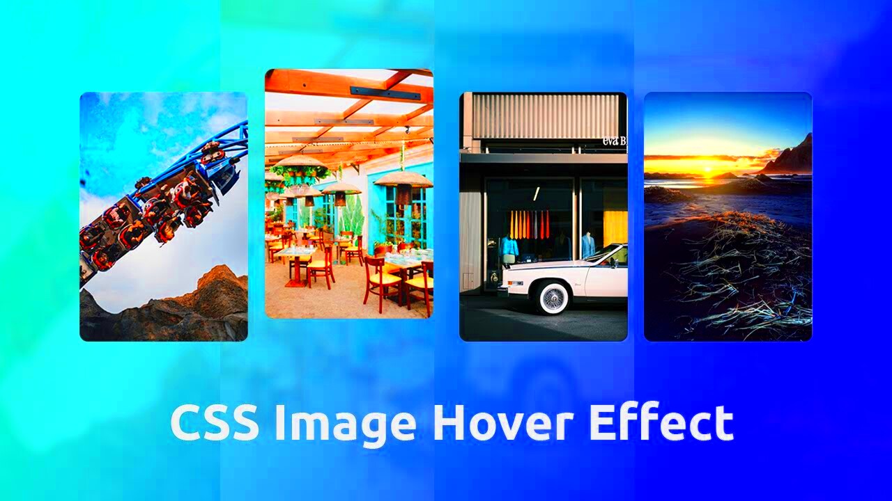
Images are an essential part of web design, and making them interactive can improve the user experience. One popular way to add interactivity is by making images grow or expand when users interact with them, such as hovering over or clicking on them. This effect draws attention to specific elements and can make a website feel more dynamic and engaging.
CSS provides simple yet powerful tools to create this effect, and with just a few lines of code, you can control how and when images grow. In this section, we'll dive into the basics of how CSS can help you achieve this and explain some core concepts to get you started.
CSS Transform Property: The Key to Image Scaling
The transform property in CSS is one of the most crucial tools for scaling images. This property allows you to apply different transformations to HTML elements like scaling, rotating, or translating them. In the case of image growth, scaling is the specific transformation we are interested in.
Here's how the basic syntax works:
transform: scale(1.5);This code increases the size of an element by 1.5 times its original dimensions. The value inside the scale() function determines the amount of growth or shrinkage. For example:
- scale(1) - No change in size.
- scale(1.2) - Grows the element by 20%.
- scale(0.8) - Shrinks the element by 20%.
Scaling can be applied uniformly to both width and height, or you can control these dimensions independently using scaleX() and scaleY(). This makes the transform property extremely flexible when you want to adjust the size of images dynamically.
Creating a Simple Image Growth Effect with CSS
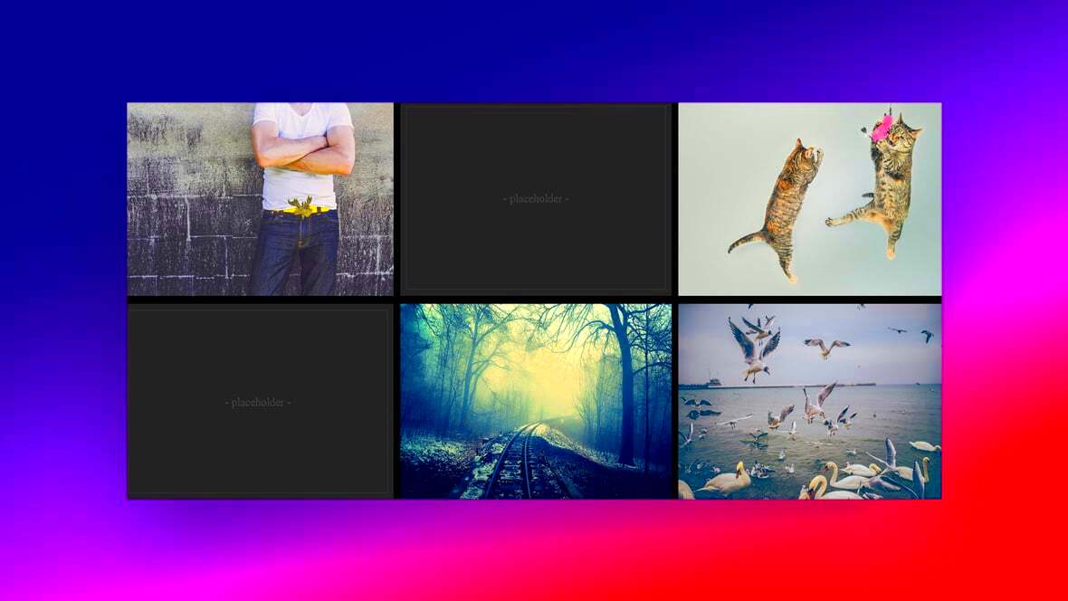
Let’s create a simple image growth effect to see the transform property in action. Below is a basic example:
img {
    width: 100px;
    height: 100px;
    transition: transform 0.5s ease;
}

img:hover {
    transform: scale(1.2);
}
In this example, the image starts at 100x100 pixels. When a user hovers over the image, the transform property kicks in, scaling the image to 120% of its original size. The transition property is added to make the effect smooth, taking 0.5 seconds to complete.
You can adjust the scaling factor and the transition duration to create the effect that best fits your design needs. This simple hover effect is an excellent starting point for adding interactive visuals to your website.
Adding Trans
Common Mistakes to Avoid When Scaling Images
While scaling images using CSS is a straightforward process, there are some common mistakes that can lead to poor user experience or performance issues on your website. Avoiding these pitfalls ensures your images not only look great but also function well across different devices and browsers.
Here are some of the most common mistakes:
- Not using the transition property: Without a smooth transition, the image will abruptly change size, which can look unpolished and jarring to users.
- Scaling images too much: Over-scaling (e.g., using
scale(2)or higher) can cause images to become pixelated or distorted, especially if the original image resolution is low. - Forgetting to account for different screen sizes: Ensure that your image scaling works well on both desktop and mobile devices. What looks good on a large screen might break the layout or create usability issues on smaller screens.
- Neglecting performance optimization: Large images that are frequently scaled can slow down page load times. It’s essential to optimize your images for web use by compressing them and using modern formats like WebP.
- Overusing hover effects: While hover effects are great for desktop users, remember that many mobile devices don’t support hover states, so consider using click-based interactions for mobile users.
By avoiding these mistakes, you can ensure that your image scaling effects enhance, rather than hinder, your website's performance and user experience.
FAQs About Image Growth Using CSS
Here are some frequently asked questions about implementing image growth effects using CSS:
- Can I control the direction of image growth?
Yes, you can. By usingscaleX()andscaleY(), you can control the horizontal and vertical growth of an image independently. This allows for more customized effects, such as only expanding the width or height of an image. - Will the image quality be affected when scaled?
If the original image resolution is low, scaling it up too much may cause it to become pixelated. To avoid this, always use high-resolution images and consider optimizing them for web use to avoid performance issues. - How can I reverse the effect after hovering?
By default, CSS automatically reverts the image back to its original size once the user moves their cursor away. You don’t need to add extra code for this unless you want more control over the animation. - Can I apply image scaling to multiple elements?
Absolutely! You can use class selectors to apply the scaling effect to multiple images or any other HTML elements at once, making it easier to implement consistent design patterns across your website. - What can I do to ensure image scaling works on all devices?
Make sure your CSS is responsive. Use media queries to adjust the scaling effect for smaller screens, ensuring that mobile users have a good experience as well.
Conclusion: Enhancing User Experience with CSS Image Effects
Incorporating CSS image growth effects is a simple yet effective way to make your website more interactive and engaging. By using properties like transform and transition, you can create smooth, visually appealing animations that draw users’ attention to key areas of your site.
However, to make the most of these effects, it’s crucial to avoid common mistakes such as over-scaling or neglecting responsiveness. With careful consideration of screen sizes, image quality, and performance, you can ensure that your image scaling effects enhance user experience without compromising the website’s speed or functionality.
By mastering these techniques, you’ll have a powerful tool in your web design toolkit that can elevate the look and feel of your website while keeping users engaged.
 admin
admin