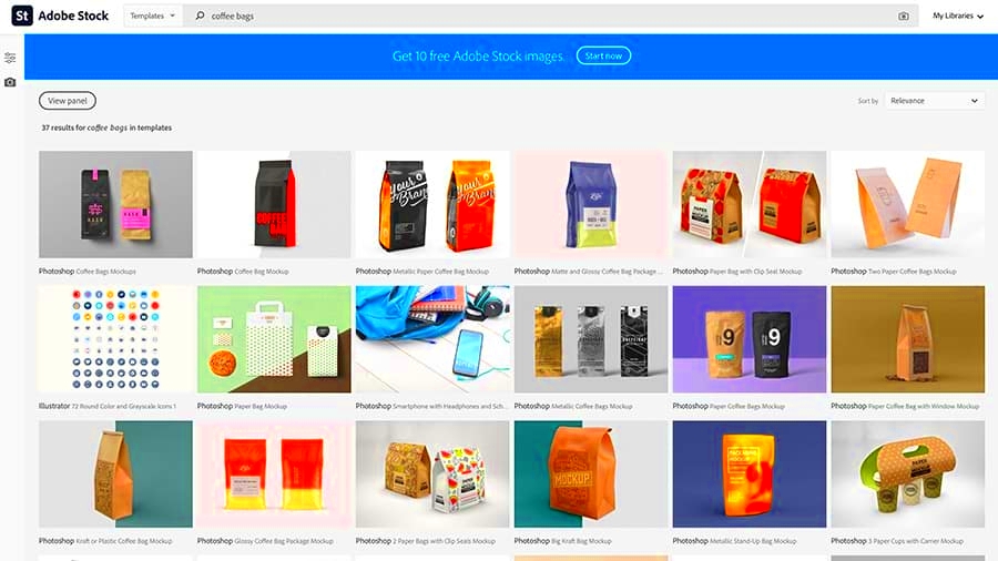
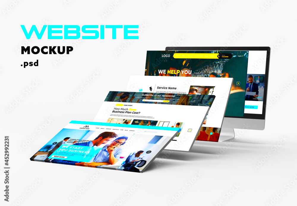
Adobe Stock mockup templates offer an excellent means to display your creations with a touch of realism and professionalism. Picture this you’ve dedicated time perfecting a logo but showcasing it on a plain page doesn’t quite capture the essence of your efforts.That’s where mockup templates prove invaluable. They enable you to seamlessly integrate your designs into settings making them appear as though they’ve already made their mark in the world. It’s akin, to providing your work a platform, to dazzle on. I vividly recall the moment I first utilized a mockup template; it felt enchanting witnessing my designs come alive, in an instant.
Choosing the Right Mockup Template for Your Project

Choosing the right mockup template can greatly impact the way your design is viewed. Here's a guide on how to go about it:
- Understand Your Needs: Think about what you want to highlight in your design. Are you focusing on a logo, a product, or perhaps a website design? This will guide you in choosing a template that complements your project.
- Match the Style: Ensure the mockup’s style aligns with your design’s tone. For instance, a modern logo might look best on a sleek, minimalistic mockup, while a vintage design could benefit from a more classic template.
- Check for Quality: Opt for high-resolution templates to ensure your final presentation is crisp and clear. Low-quality mockups can undermine your design's impact.
Through my own journey I’ve learned that selecting a mockup can take a design from being average to truly exceptional. Taking the time to find the perfect fit is definitely worthwhile.
How to Customize Adobe Stock Mockup Templates
Putting your spin on
Adobe Stock mockup templates is all about adding your unique flair. Here’s a simple walkthrough to kick off your journey:
- Open Your Template: Start by opening the mockup template in Adobe Photoshop. Most mockups come with well-organized layers, so you can easily find where to place your design.
- Insert Your Design: Locate the smart object layer where you need to insert your design. Double-click the smart object, paste your design, and save the changes. Your design will automatically update in the mockup.
- Adjust and Fine-Tune: Make any necessary adjustments to fit your design perfectly within the mockup. You might need to resize or reposition your artwork for the best effect.
- Apply Effects: Some templates come with additional effects like shadows or reflections. Adjust these settings to match your design’s look and feel.
I constantly remind myself to try out various settings and modifications. A small change can often have a big impact. The more you hone your skills the more adept you'll become at optimizing these templates.
Tips for Using Mockups Effectively
Leveraging mockups can really help your designs shine and catch the eye. Check out these suggestions to maximize the impact of your
Adobe Stock mockup templates.
- Be Selective: Not every mockup will fit every design. Choose mockups that complement the style and message of your project. For example, a tech startup might benefit from a sleek, futuristic mockup, while a handmade crafts business might look better with something rustic and warm.
- Focus on Details: Pay attention to the small details in your mockup. Adjust lighting, shadows, and colors to ensure your design looks natural and integrated into the scene. These nuances can make your presentation feel more realistic and polished.
- Keep It Simple: Sometimes less is more. Don’t clutter the mockup with too many elements or designs. A clean and simple presentation often has a more powerful impact.
- Test Different Perspectives: Experiment with different angles and views. Sometimes changing the perspective can provide a fresh look and enhance the overall impact of your design.
Based on what I’ve seen, I’ve discovered that a well chosen mockup can elevate a design showcase from ordinary to captivating. Keep in mind that a mockup serves as more than just a setting; it’s a chance to present your design in the way possible.
Saving and Exporting Your Customized Mockups
After personalizing your mockup it’s important to save and export it correctly. Here’s a guide on how to do that efficiently.
- Save Your Work: Regularly save your file to avoid losing any changes. Use the PSD format if you plan to make future adjustments. This format preserves all layers and edits.
- Export for Sharing: When you’re ready to share your mockup, export it in a format that suits your needs. For online use, JPEG or PNG are commonly used. If you need high-quality prints, consider exporting in TIFF or PDF format.
- Check Resolution: Ensure the resolution of your exported file is high enough for your intended use. For digital displays, 72 DPI is usually sufficient, but for printing, you’ll need at least 300 DPI.
- Optimize File Size: Large files can be cumbersome to share or upload. Use compression tools to reduce file size without sacrificing quality.
Based on what I’ve seen exporting your work correctly can really impact how it gets perceived. A mockup that’s saved can showcase your design in a way, whether you’re presenting it to a client or featuring it in your online portfolio.
Common Issues and How to Fix Them
When using mockups you may run into a few bumps along the way. Here are some problems you might come across and their solutions.
- Design Doesn’t Fit: If your design doesn’t fit well within the mockup, it might be due to incorrect scaling or alignment. Go back to the smart object layer and adjust the size or position of your design until it fits perfectly.
- Blurry or Pixelated Images: This often happens if the resolution is too low. Ensure you’re working with high-resolution files and export at the correct DPI for your intended use.
- Layer Visibility Issues: Sometimes layers might not appear as expected. Check that all necessary layers are visible and correctly ordered in your Layers panel.
- Color Mismatch: If your design’s colors don’t match the mockup, check the color profiles and ensure they are consistent across both your design and the mockup.
I recall facing challenges with certain matters in the beginning. It required some experimentation to figure things out, but now I can resolve these problems more swiftly. With a touch of persistence and repetition you'll discover that most issues can be easily resolved.
Where to Find More Resources and Tutorials
The journey of learning goes beyond merely utilizing mockups; there’s an endless realm of knowledge waiting to be uncovered! If you’re eager to explore the realm of
Adobe Stock mockups and design more extensively consider exploring these informative resources:
- Adobe’s Official Tutorials: Adobe offers a treasure trove of tutorials on their website. These tutorials cover everything from basic to advanced techniques, and they are created by experts who know the ins and outs of Adobe products.
- YouTube Channels: Channels like “Phlearn” and “Tutvid” provide excellent video tutorials that are easy to follow. I remember stumbling upon a video by Phlearn that taught me how to master layer effects, which made a significant difference in my mockup presentations.
- Design Forums and Communities: Websites like Behance and Dribbble are not just platforms to showcase your work but also great places to connect with other designers. You can find insightful posts, tutorials, and discussions that can help you enhance your skills.
- Online Learning Platforms: Websites like Udemy and Skillshare offer in-depth courses on Adobe Photoshop and design techniques. They often include practical assignments that can help you apply what you’ve learned.
Throughout my path as a designer I’ve discovered that tapping into various sources and nurturing a sense of curiosity are essential for progress. The greater your knowledge the more adaptable you become in your artistry.
Frequently Asked Questions
I frequently come across inquiries regarding the utilization of
Adobe Stock mockup templates. Here are the questions and their corresponding responses.
What file formats are best for mockups?
- For digital use, JPEG and PNG are commonly used. For print, go with TIFF or PDF. Ensure your file is in high resolution for the best quality.
Can I use mockups for commercial purposes?
- Yes, you can use mockups for commercial purposes, but make sure you check the licensing terms of the mockup templates to ensure you’re compliant.
How do I fix a blurry mockup?
- Blurriness often results from low resolution. Ensure your design is high resolution and the mockup template itself is not too pixelated.
Are there free mockups available?
- Yes, many websites offer free mockups. However, they may have limited options compared to paid ones. Websites like Freepik and GraphicBurger are good places to start.
I’ve discovered that tackling these frequently asked questions at the outset can prevent a lot of hassle. It’s really about getting the appropriate tools and knowing how to utilize them effectively.
Conclusion
Using Adobe Stock mockup templates can really elevate your design presentations. Whether its choosing the perfect mockup tailoring it to your needs or troubleshooting common challenges the journey may appear complex but it’s definitely worthwhile. In my experience patience and practice play key roles in achieving results. Keep in mind that every mockup presents a chance to highlight your design in the way.As you delve deeper into these tools and make the most of them dont hesitate to try out new things and expand your knowledge. The more you work with mockups the more skilled you'll become at crafting captivating visuals that genuinely showcase your imagination. Cheers to enhancing the brilliance of your designs!
 Choosing the right mockup template can greatly impact the way your design is viewed. Here's a guide on how to go about it:
 admin
admin


