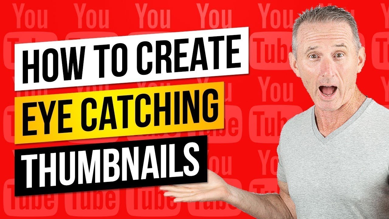
Introduction
Welcome to our comprehensive guide on creating eye-catching
Vimeo thumbnail images! In this post, we'll delve into the importance of thumbnails, explore best practices for creating captivating images, highlight useful tools and resources, showcase successful case studies, and discuss common mistakes to avoid. Whether you're a seasoned content creator or just starting out, mastering the art of thumbnail creation can significantly enhance the visibility and engagement of your videos on
Vimeo. Let's dive in!
content of the video, they are more likely to click through to watch the full video:
- Conveying Information: Thumbnails provide a snapshot of the content within the video. They can convey the mood, theme, or key points of the video, helping viewers decide whether it aligns with their interests or needs.
Furthermore, thumbnails play a crucial role in various aspects of online content consumption, including:
- Browsing Experience: When users are browsing through a list of videos, thumbnails are often the primary factor influencing their decision to click on a particular video. A compelling thumbnail can capture their attention and encourage further exploration.
- Search Results: In search engine results pages (SERPs) and within video-sharing platforms' search functionalities, thumbnails are prominently displayed alongside titles and descriptions. A visually striking thumbnail can stand out amidst the search results, increasing the likelihood of clicks.
- Recommendations: Platforms like Vimeo use algorithms to recommend videos to users based on their viewing history and preferences. Thumbnails play a crucial role in these recommendations, as they are the visual cues that prompt users to engage with suggested content.
In essence, thumbnails serve as the gateway to your video content, influencing viewer perceptions, engagement levels, and ultimately, the success of your video on platforms like
Vimeo.
Best Practices for Creating Vimeo Thumbnail Images

Creating captivating
Vimeo thumbnail images requires careful consideration of various factors, including composition, design elements, and viewer engagement. Follow these best practices to ensure your thumbnails stand out:
- Use High-Quality Images: Start with high-resolution images that are clear, crisp, and visually appealing. Avoid using low-resolution or blurry images, as they can detract from the professionalism of your thumbnail.
- Highlight Key Elements: Your thumbnail should convey the essence of your video and capture viewers' attention at a glance. Highlight key elements such as central characters, important objects, or compelling visuals that encapsulate the video's content.
- Optimize for Composition: Pay attention to composition principles such as balance, symmetry, and focal points. Arrange visual elements in a way that guides the viewer's eye and creates visual interest.
- Use Contrasting Colors: Choose colors that stand out against the background and grab attention. Use bold, vibrant colors sparingly to draw focus to important elements within the thumbnail.
- Include Text Thoughtfully: If you decide to include text in your thumbnail, keep it concise and relevant. Use clear, easy-to-read fonts and ensure that the text complements the visuals rather than overpowering them.
- Emphasize Branding: Incorporate branded elements such as logos, colors, or visual themes to reinforce your brand identity. Consistency in branding helps viewers recognize your content across platforms.
- Test Different Variations: Experiment with different thumbnail designs to see which ones resonate best with your audience. A/B testing can help you identify the most effective thumbnail elements for driving clicks and engagement.
Furthermore, consider the following additional tips to optimize your
Vimeo thumbnail images:
| Aspect Ratio: | Ensure that your thumbnail's aspect ratio adheres to Vimeo's recommended dimensions (1280x720 pixels). This ensures compatibility and consistency across devices and screen sizes. |
| File Size: | Keep your thumbnail file sizes small to ensure fast loading times and smooth browsing experiences for viewers. |
| Mobile Optimization: | Test your thumbnails on mobile devices to ensure they are visually compelling and easy to view on smaller screens. |
By following these best practices and additional tips, you can create
Vimeo thumbnail images that effectively grab viewers' attention, encourage clicks, and enhance the overall success of your video content.
Tools and Resources for Thumbnail Creation
When it comes to creating eye-catching Vimeo thumbnail images, having the right tools and resources at your disposal can significantly streamline the process and elevate the quality of your thumbnails. Here are some recommended tools and resources:
- Graphic Design Software: Utilize graphic design software such as Adobe Photoshop, Adobe Illustrator, or Canva to create custom thumbnails from scratch. These tools offer a wide range of features and templates to help you design professional-looking thumbnails.
- Online Thumbnail Generators: Explore online thumbnail generator tools like Thumbnail Blaster, Snappa, or Picmaker. These platforms offer user-friendly interfaces and pre-designed templates that you can customize to create thumbnails quickly and easily.
- Stock Image Libraries: Access stock image libraries such as Shutterstock, Adobe Stock, or Unsplash to find high-quality images that you can use in your thumbnails. These libraries offer a vast selection of images across various categories, ensuring you find the perfect visuals for your thumbnails.
- Icon and Symbol Libraries: Incorporate icons and symbols into your thumbnails to enhance visual appeal and convey information effectively. Websites like Flaticon, Iconfinder, or The Noun Project offer extensive collections of icons and symbols that you can use royalty-free in your thumbnails.
- Video Editing Software: If you're creating thumbnails for video content, consider using video editing software such as Adobe Premiere Pro, Final Cut Pro, or DaVinci Resolve. These tools allow you to capture high-resolution frames from your videos and use them as thumbnails.
In addition to these tools, consider leveraging the following resources to enhance your thumbnail creation process:
| Tutorials and Guides: | Explore online tutorials, guides, and courses on thumbnail design and optimization. Platforms like YouTube, Skillshare, and Udemy offer a wealth of educational resources to help you improve your thumbnail creation skills. |
| Community Forums and Groups: | Join online communities, forums, and social media groups dedicated to graphic design and video creation. Engaging with fellow creators can provide valuable insights, feedback, and inspiration for your thumbnail designs. |
| Feedback and Testing Tools: | Utilize feedback and testing tools such as SplitMetrics or UsabilityHub to gather feedback from real users on your thumbnail designs. This feedback can help you refine and optimize your thumbnails for maximum impact. |
By leveraging these tools and resources effectively, you can create compelling Vimeo thumbnail images that capture viewers' attention and drive engagement with your video content.
Case Studies: Successful Thumbnail Strategies
Examining real-world examples of successful thumbnail strategies can provide valuable insights into what works best for engaging viewers and driving clicks. Here are some notable case studies:
- YouTube Creator Case Study: How Marketers Guide Increased Click-Through Rates by 200%
In this case study, the YouTube channel "Marketers Guide" experimented with different thumbnail designs for their video tutorials. They found that thumbnails featuring close-up shots of the presenter's face alongside bold, contrasting text resulted in a 200% increase in click-through rates compared to thumbnails with generic visuals. This highlights the importance of human faces and clear text in capturing viewers' attention.
- Travel Vlogger Case Study: Optimizing Thumbnails for Mobile Viewers
A popular travel vlogger optimized their thumbnail designs specifically for mobile viewers, considering the smaller screen size and browsing behavior of mobile users. They found that thumbnails with vibrant colors, simple graphics, and minimal text performed exceptionally well on mobile devices, leading to a significant increase in views and engagement from mobile viewers.
- Educational Channel Case Study: Maximizing Thumbnail Real Estate
An educational channel focused on science and technology experimented with maximizing thumbnail real estate by strategically placing relevant visuals and text within the thumbnail frame. By utilizing every pixel of the thumbnail to convey key information about the video content, they saw a substantial improvement in click-through rates and viewer engagement.
Furthermore, analyzing successful thumbnail strategies across various platforms can reveal common trends and best practices:
| Consistency: | Successful creators maintain consistency in their thumbnail designs, using similar visual elements, colors, and branding across their videos. This consistency helps build brand recognition and fosters trust among viewers. |
| Relevance: | Effective thumbnails accurately represent the content of the video and set clear expectations for viewers. Thumbnails that are relevant to the video's topic or theme tend to attract more engaged viewers. |
| A/B Testing: | Many successful creators conduct A/B testing to experiment with different thumbnail designs and optimize for maximum engagement. By analyzing performance metrics, they can identify the most effective thumbnail strategies for their audience. |
By studying these case studies and adopting proven thumbnail strategies, content creators can increase the visibility, click-through rates, and overall success of their video content on platforms like Vimeo.
Common Mistakes to Avoid
While creating Vimeo thumbnail images, it's important to steer clear of common pitfalls that can diminish the effectiveness of your thumbnails and hinder viewer engagement. Here are some mistakes to avoid:
- Poor Image Quality: Using low-resolution or blurry images in your thumbnails can detract from their visual appeal and professionalism. Always opt for high-quality images that are clear and crisp.
- Overcrowded Design: Avoid overcrowding your thumbnails with too many elements, such as excessive text, graphics, or visual effects. A cluttered thumbnail can confuse viewers and make it difficult for them to discern the video's content.
- Irrelevant Thumbnails: Ensure that your thumbnails accurately represent the content of the video. Using misleading or irrelevant thumbnails can lead to viewer disappointment and distrust, resulting in lower engagement rates.
- Unreadable Text: If you include text in your thumbnails, ensure that it is clear, legible, and easy to read, even at smaller sizes. Avoid using overly decorative fonts or text colors that blend into the background.
- Ignoring Branding: Consistency in branding is key to building recognition and trust among viewers. Avoid neglecting branded elements such as logos, colors, and visual themes in your thumbnails.
Additionally, be mindful of the following common mistakes when creating Vimeo thumbnail images:
| Ignoring Thumbnail Guidelines: | Each platform may have specific guidelines and requirements for thumbnail images. Ignoring these guidelines can result in thumbnails being cropped or resized incorrectly, affecting their visibility and appeal. |
| Copying Competitors: | While it's important to stay informed about industry trends and competitor strategies, avoid directly copying their thumbnail designs. Instead, focus on creating unique and authentic thumbnails that resonate with your target audience. |
| Failure to Test: | Not testing different thumbnail variations or analyzing performance metrics can prevent you from identifying the most effective thumbnail strategies. Regularly test and iterate on your thumbnails to optimize for maximum engagement. |
By avoiding these common mistakes and adhering to best practices, you can create Vimeo thumbnail images that effectively capture viewers' attention, drive clicks, and enhance the overall success of your video content.
Conclusion
In conclusion, mastering the art of creating eye-catching Vimeo thumbnail images is essential for maximizing the visibility and engagement of your video content. By understanding the importance of thumbnails, following best practices, leveraging tools and resources, studying successful case studies, and avoiding common mistakes, you can create thumbnails that effectively capture viewers' attention and drive clicks.Remember to prioritize high-quality images, highlight key elements, optimize for composition and contrast, and incorporate branding elements to ensure consistency and recognition across your thumbnails. Continuously test and iterate on your thumbnail designs to identify the most effective strategies for engaging your target audience.By implementing these tips and techniques, you can elevate the visual appeal of your Vimeo thumbnails, increase click-through rates, and ultimately, enhance the success of your video content on the platform.
 Creating captivating Vimeo thumbnail images requires careful consideration of various factors, including composition, design elements, and viewer engagement. Follow these best practices to ensure your thumbnails stand out:
 admin
admin


